MyWebsite
I have been making websites all my life, but never one for myself. Well here is MyWebsite a professional place to share my own projects with the world. As you can see, It's not the most complicated or craziest design, but it's minimalistic, simple and clean. The main attribute I wanted to preserve in my web is its speed. This is why I don't use external frameworks or platforms as wordpress: just HTML, CSS and JavaScript. In this post I will share with you the keys of my design and how it works.
Website structure
The most important practice when creating a project is to properly structure the folder and all your documents according to good practices. To assist others, I have created a website structure template that can be downloaded and used to start building your site.
HTML
In order to please Sr.Google, all the meta tags have been written carefully with titles and descriptions trying to get the best SEO score possible for my personal brand and my projects. To give the user a full visual experience, it is critical to have all the possible favicons, banners for social media sharing or google chrome theme color on mobiles. The body is divided into three large blocks using the descriptor tags incorporated in HTML5.
<body>
    <header> ... </header>
    <main>   ... </main>
    <footer> ... </footer>
</body>
CSS
a.css is the main stylesheet for the entire website and should always load first for proper viewing. For specific elements or styles that are only required on certain pages, there are other .css files such as the contact form or the mobile menu hamburguer. The technique that I always use when starting a new general css is to set these styles.
* {
    margin: 0;
    padding: 0;
    border: 0;
    font-size: 100%;
}
Some people call it "CSS Reset" because it deletes all differences across browsers and you will never again encounter strange things that you did not expect. For a large website, this could be a problem as it is too heavy on the rendering agent to apply rules to every single element in the document. However, for a website like mine, it works fine.
JS
a.js is the website engine; it controls all dynamic elements such as colors, click events, copy to clipboard, and manages all the CSS for correct web representation. A pattern that I usually follow in my JS object is to make a play on words with the variable name and the start function, for example, this one using my last name (Elso).
var el = {
    events: function(){ ... },
    load: function(){ ... },
    so: function(){
        el.load();
        el.events();
    }
};
el.so();
Another good practice is to place the object functions in an upward order, so a function will always call functions that are higher. The load function controls all the elements in the first moment that the page is loaded, and the events function controls everything that needs to change at specific moments.
Design
Why a light interface? Well, for me, a light interface represents cleanliness. Why color swapping? The most used highlight color in my previous designs was blue. It's time to innovate, and with no other preferred color, why not use all of them? The idea is to capture the user's visual attention since there are no colorful images.
Distribution and spaces
This is something I learned from my mentor Fernan García de Zúñiga: "all numbers have to be multiples of eight", and I always keep this in mind while programming an interface. The 8 point grid system respects the variety of screen sizes and pixel densities for all devices. So, height or width, margin or padding will be an increment of 8, which will give the user a consistent aesthetic feel.
Colors swapping
If you've noticed, when you load a page, it starts with a different random color and then the transition begins. I have used an array with 8 possible colors and the Fisher-Yates algorithm to shuffle the array randomly each time the page is loaded. The algorithm works by:
- Starting at the last position in the array and moving towards the first.
- In each iteration, selecting a random element from the current position to the end of the array.
- Swapping the selected element with the element at the current position.
- Continuing with the previous iteration until you reach the first position in the array.
This algorithm is very efficient and guarantees an equal distribution of the elements in all positions of the array.
let colors = ["#0F74DC", "#0a8288", "#1d860b", "#7e7608", "#a9650e", "#dc0f0f", "#dc0f6c", "#c70fdc"];
for (let i = colors.length - 1; i > 0; i--) {
    const j = Math.floor(Math.random() * (i + 1));
    [colors[i], colors[j]] = [colors[j], colors[i]];
}
Font
Roboto is a sans-serif Google font and is perhaps the closest approach to Helvetica. "Modern, yet approachable" is how they describe it, and it's true, it's a clean typeface with a straightforward, geometric design that offers clean lines, rounded and somewhat emotional. For the code module, the typeface I use is another from the family, Roboto Mono. Monospaced typography has always been used in programming languages (text editors and terminals), so this typography immediately brings to mind the idea that you are reading source code.
Contact form
Currently, MyWebsite is hosted on Cloudflare's Pages service, which allows for easy creation and publishing of websites. However, this service does not allow for backend code execution, so only static websites can be published. The form itself can be created with HTML and CSS, but to implement a message processing logic I need to execute code on the backend. Instead of moving the website to a different host, we will take advantage of the tools provided by AWS to implement a serverless backend that handles this logic.
Check out the full post where I detail how I implemented the contact form using a serverless backend on AWS.
Page quality
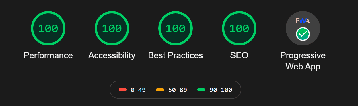
Lighthouse is an open-source, automated tool for improving the quality of web pages. If you generate a report on my website, you will get that result. Nice! Sr.Google is happy with me.
Performance
You must include a preconnect in the head section for external resources that we are going to work with, for example, third-party usage like Google Analytics. We must also preload our page fonts.
<link rel="preconnect" href="https://www.google-analytics.com">
<link rel="preload" href="/font/RobotoMono-Regular.woff2" as="font" crossorigin="anonymous">
It's important to have properly sized images, which we can achieve using online compression tools or other programs that don't decrease the quality of the photo to the human eye. Minifying the CSS and JS files, enabling Gzip compressor on your resource requests, using HTTP/2, and developing an efficient cache policy will improve web performance.
This website implements lazy loading, a technique that improves the performance of a website by delaying the loading of images until they are needed. When a user visits the webpage, only the images that are visible on the screen are loaded. The rest of the images are left unloaded until the user scrolls down the page. This can significantly reduce the amount of data that needs to be transferred, making the webpage load faster, especially on mobile devices or when the internet connection is slow.
const imgs = document.querySelectorAll('img[data-src]');
imgs.forEach(function(img) {
    const observer = new IntersectionObserver(function(entries) {
        if (entries[0].isIntersecting) {
            img.src = img.dataset.src;
            observer.unobserve(img);
        }
    });
    observer.observe(img);
});
The code for this implementation uses the Intersection Observer API to select all images on the page that have a data-src attribute, and then creates an Intersection Observer for each image. The Intersection Observer watches for when the image enters the visible area of the user's screen, and when this happens, it assigns the value of the data-src attribute to the src property of the image, causing it to be loaded and displayed on the page. The code also calls the unobserve method to stop watching the image when it is no longer needed.
Accessibility
Background and foreground colors have a sufficient contrast ratio (at least 4.5:1), which you can check using the inspect tool or websites. The html element has "en" as its [lang] attribute, [id] attributes on the page are unique, all the pages have a "title" element less than 70 characters, and all the image elements have [alt] attributes.
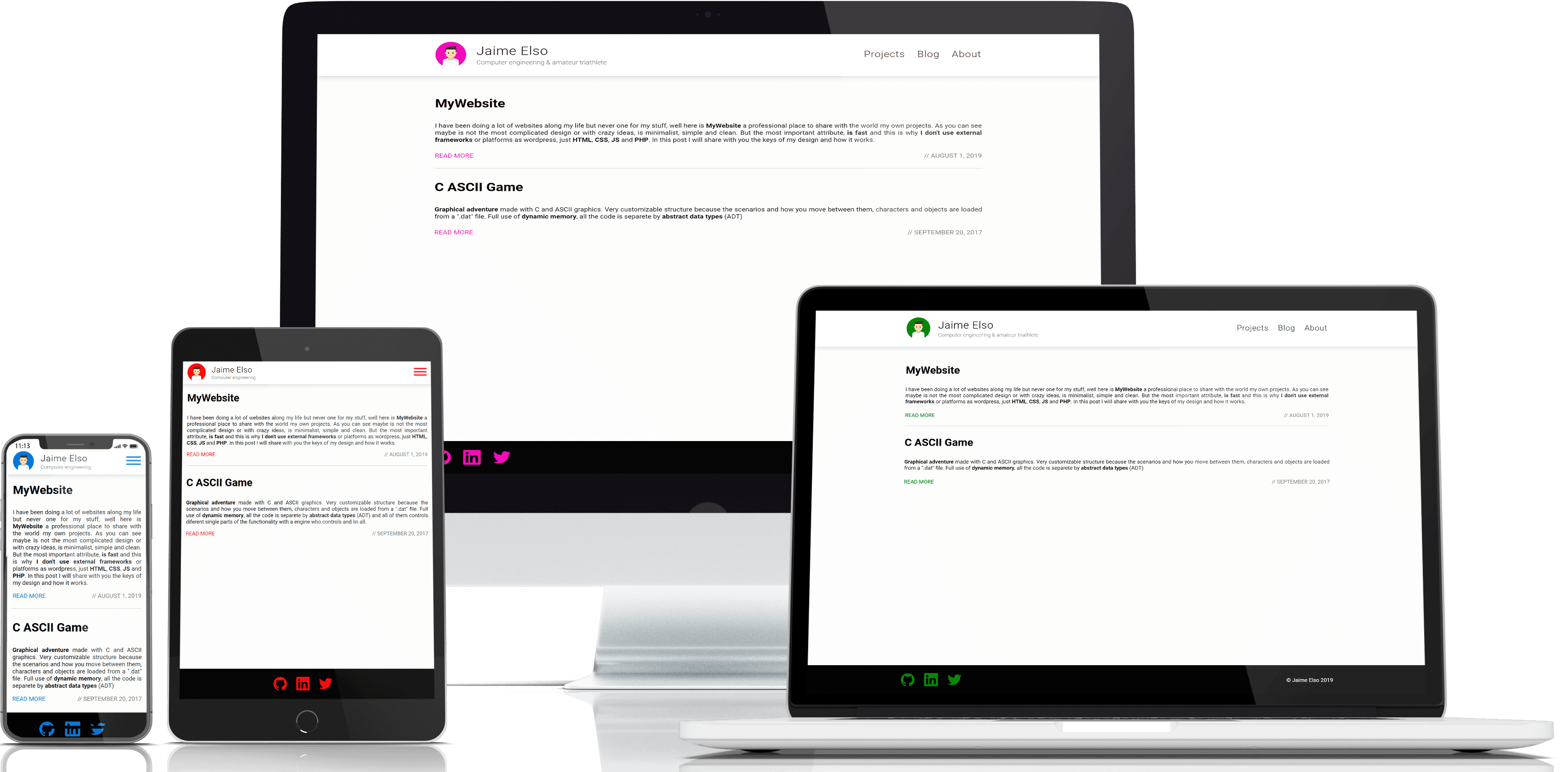
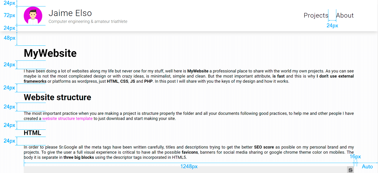
Responsive design is a way to put together a website so that it automatically scales its content and elements to match the screen size on which it is viewed. There are different ways to achieve this, such as using media queries in CSS, which can be useful but require a lot of code for different screen sizes. A better practice is using resizable containers with a non-fixed size. There are only two significant changes between mobile and desktop: how the header elements are displayed, and hiding the copyright message in the footer when the screen width is less than 800px. This is an example of a div container that I always use to set a maximum width (for the largest screens) and a calculated width when the screen size is less than the maximum.
div.container {
    max-width: 1248px;
    padding: 0 16px;
    width: calc(100% - 32px);
    margin: 0 auto;
}
Best Practices
Use HTTPS instead of HTTP, use HTTP/2 for your own resources, make sure that links to cross-origin destinations are safe (using rel="noopener"), include the HTML doctype, ensure that there are no browser errors logged to the console, and display images with the correct aspect ratio.
SEO
The document has a valid rel=canonical and this is important because you have to set the canonical to the page URL on all pages. If you don't, you will leave the SEO score of this page to another page that you set. If the page content exists in other languages, you must indicate this in the hreflang, and you should also include the page itself with its language.
<link href="https://jaimeelso.com/post/mywebsite" rel="canonical" />
<link rel="alternate" hreflang="en" href="https://jaimeelso.com/post/mywebsite" />
In the robots.txt you specifies how you want your website to be crawled or indexed by the crawlers, and also indicate where de sitemap.xml file is.
Progressive Web App
PWAs (Progressive Web Apps) are an easy way to transform your website into desktop, Android, or iOS applications. First, you need a service-worker.js to manage offline functionality, and then you need to add a manifest.json to specify different application settings.
Thanks for reading! Catch you in the next one.